Here at Contrado, we’re all about putting YOU, our artists, at the forefront of our website.
It’s now easier than ever to get discovered as an artist on Contrado. In addition, our clever algorithm makes sure that no one is left in the back. However, there are certain criteria to be brought to the very front. So, if you’re wondering how to get featured on Contrado, the following will tell you everything you need to know.
Step 1: Set Up Your Store

Sounds obvious, doesn’t it? Well, there’s more to setting up a store than entering your email address. Our top featured artists have put care and creativity into every aspect of their store, ensuring it represents their brand to the fullest. Here are the fields to look out for:
Store Name
Your store should have a catchy, creative name that stands out from the crowd.
Tagline
Taglines are visible one-liners that sit above all the products in your store. Less descriptive than your artist bio, your tagline should offer a bite-sized taste of your creative style and product range.
Artist Bio
This is a detailed description of your story as an artist. Many artists choose to mention their education or training, inspiration, exhibitions, art style, methods of creating, and other artistic pursuits here.
Logo
Add your brand’s logo, your picture, a popular design, or another image to introduce yourself to your customers.
Banner
Add your best selling design, some of your products, or another banner to give customers a visual of your brand and style.
Example: Emeline
One of our best selling artists, Emeline has this down to a science:
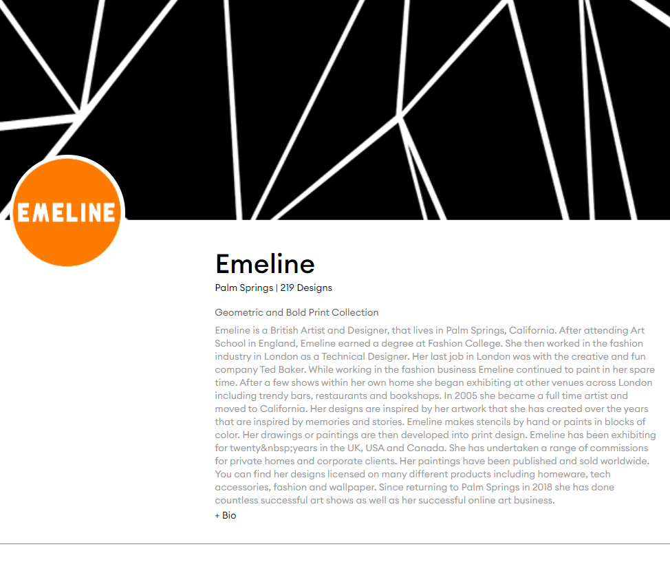
The banner’s design, bold contrasting logo, detailed artist’s bio, and minimalist tagline all give an air of professionalism and expertise to Emeline’s store. In short, her store design is brilliant.
Highlights
- Simple yet unique store name
- Brightly coloured, eye-catching logo
- Best-selling design as the banner
- Tagline is succinct and descriptive
- Bio is detailed, engaging, and impressive
Step 2: Collections & Products

Stores perform best with a wide variety of products. A versatile product range means you’re more likely to cater to your customers’ needs, and organized collections make for an easier browsing experience. Here are the main criteria:
Lots of Products
Load up your store with products. The more products you add, the more likely you are to appear throughout the website, and the more likely you are to offer something a customer is looking for.
Versatile Range
Many artists choose to focus on a specific niche like holiday wear, homeware, or fitness accessories, while others design as many products as they can. Both approaches are absolutely fine, but make sure there’s versatility in your offering!
Different Designs on Different Products
As well as a wide product offering, each product should boast multiple designs of yours. Giving your customers options for each product is a sure-fire way to guarantee sales.
Multiple Collections
Now, the key to having a large product range is organizing it coherently. Most artists focus on one product in each selection, but some separate by design or group similar products together (ie. suitcase, luggage tags and luggage straps).
Check for New Product Releases
We’re always cooking up new and exciting products for you to design! Customers are always on the lookout for new items, so keep your store up-to-date with new product launches.
Add New Products Regularly
Keeping your store active with fresh products and designs is the best way to captivate your audience. It also tells our algorithm that you’re working hard on your store, which results in a higher chance of being featured.
Example: Mentalembellisher
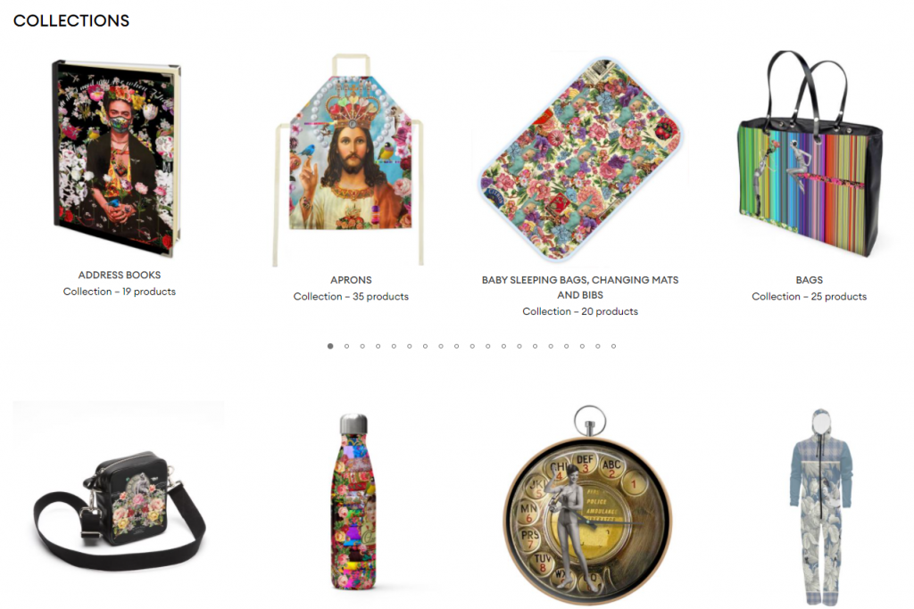
A Contrado veteran, Mentalembellisher has been with us since the beginning and boasts a beautifully unique range of products. You can find a whopping 1,502 products in her store, all neatly separated into 70+ collections.
Highlights
- Offers almost every product imaginable
- Clearly described collections
- Collections separated by product type or similar products
- A multitude of different designs on each product
- Range is likely to meet every customer’s needs
Step 3: Getting Your Designs Right

High-quality designs are a big part of actually getting sales. You won’t attract much attention if your designs are low-res, not covering the whole panel, or poorly formatted. Here are the most common mistakes to look out for:
Avoid White Borders
Make sure your image covers the entire surface area of the product. If your image is too small, try a repeat pattern or add a background colour. This is especially important for round products like plates.
Design Every Panel
It seems obvious, but make sure every panel of the product is designed to completion. Leaving even one part out may make the product look incomplete and discourage the customer from buying.
High-Quality Images
Make sure your images aren’t low resolution or faulty in any way. We’ve got tons of helpful resources to help you prepare your design in our FAQs.
Example: Inkymole
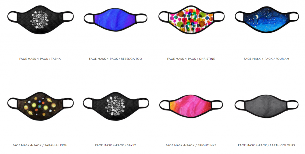
A fan favourite, Inkymole offers a wide range of designs that are expertly formatted to complement the shape of each product. For example, she utilizes the unique shape of our face masks with eye-catching and cleverly placed designs.
Highlights
- Versatile shapes, colours, and textures in each design
- Cleverly shaped to complement the mask
- Clear, crisp, and well-made designs
- Covers every inch of the product
- No white borders, low resolution, or parts left blank
Step 4: Checking Content Quality

And last, but definitely not least, you need to check your content quality, AKA product titles & descriptions! Content is an essential part of securing the sale and many artists neglect this important step. It needs to meet the following criteria:
Nailing Your Product Title
Your product name should follow this formula: ‘Product Name – Descriptor’. For example, ‘Espadrilles – Tropical Flora’. Putting the product first will make it easier for customers to find you. Avoid writing titles that are more than 2 lines – excessively long titles can put people off from buying your product.
Sell the Product Well
Assume each customer knows nothing about the product they’re looking at. The description is where they look for that information! Mention the materials, how it’s made, and any luxurious key points that would appeal to your customer.
Add Sizes, Sets & Dimensions
Sizing & dimensions should always be included in the description, as well as the set size, especially if you’ve locked any product options. Be sure to include them so your customer can make an informed purchase. Size charts are always included in product pages, so no need to add these.
Discuss Your Design
What sets your product apart is the design. That’s why your customer clicked on it in the first place. They want to know what inspired you, how you created it, why you named it that, and so on. Connect with them on a personal level and describe your artistic process.
Spelling and Grammar
Let’s take it back to grade 1 for a second: spelling matters. Your customer’s trust automatically goes down if they see a glaring spelling or grammatical error in your description. Triple-check your writing to make sure it’s correct.
Character Count
The sweet spot for product descriptions is 70 words, about 6 lines. The max amount is 150 words. Try to get as close to 70 words as you can, and fill your description with information about your design, the product itself, and how the customer can use your product.
Active Voice vs. Passive Voice
Utilize active voice & avoid sounding passive in product descriptions. Passive voice sounds something like, ‘With our Tiger Yoga Mat you will be able to work out in style.’ Active voice, in contrast, says ‘Work out in style with our Tiger Yoga Mat!’
Don’t Copy & Paste
Search engines scan for duplicate content and won’t show your product page if your content is the same as another page or website, so never copy and paste your title or description. Instead, take care to write unique content for every product.
What Not to Include
No phone numbers, emails, addresses, or other contact information should go in your product description – that’s for your artist bio. Your website link shouldn’t be here, either – you don’t want to lead your customer away from the product page.
Example: Patricia Shea Designs
Known for her vibrant, intricate watercolour patterns, Patricia Shea is not just a talented artist but a copywriting prodigy as well! Her product descriptions are informative, conversational, and give the customer incentive to buy.
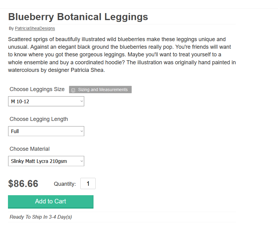
Highlights
- Describes & sells the design well
- Casual yet informative tone
- Persuasive, really sells the product
- Encourages customer to buy more products
- 71 words – perfect!
How to Get Featured on Contrado
In summary, if you follow all these steps, your store will be climbing the ranks to success in no time. We want to see you succeed, so give it your best effort, and let’s make some sales!
And if you’re not selling with us yet, there’s never been a better time to join! Contrado stores offer you 450+ products to design, 20%+ commission, and a whole lot more. Enter the wonderful world of selling with Contrado below.
